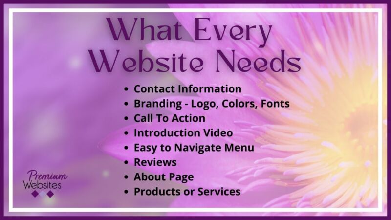
What Every Website Needs
What Every Website Needs

List of Items Every Website Must Include
Although this is not a comprehensive list, everything on this list should be included on all websites. These items are the bare minimum.
Contact Information
I cannot tell you how many people think that their website does not need contact information. I can tell you that I will not buy from any website (or person) that does not provide me a way to call them. If I have a problem with a product or service, I want to call someone to get the problem resolved. When websites do not include a phone number, I move on. Websites should also include email addresses and a form.
Branding
Many small business owners do not want to pay for a logo. They might think they do not really need one. Every business needs a logo, brand colors, and brand fonts. You can get these professionally created by a graphic designer, or go to a marketplace like Fiverr. There are also online websites that will create a free logo for you.
Once your logo is created, make note of the color numbers used in the logo. These colors need to be used on your website as well. Also note the fonts chosen. For the web, it is best to choose fonts from Google Fonts. Most website building platforms will integrate with Google Fonts so that your website fonts can go with your logo fonts – completing your brand look.
Call To Action (CTA)
Your Call to Action is the next step you want someone to take. This could be a number of things like:
- Download something useful. This allows you to collect their name and email address so you can start a relationship with them and follow up. Be sure what you are offering will move them forward. For example, I offer a website design checklist. This will get them ready for the website design conversation.
- Schedule a free discovery call or consultation. Sometimes people will schedule a call with you, especially if they were referred to you by a trusted friend. If they are cold from the internet, this is likely not a good first step.
- Get a free quote. This is used in the construction industry. Provide a form where they can give you details on their specific project, and then you can call them for any missing details and provide a quote.
These are a few examples. What you do not want to do is nothing. People will not move forward if they do not have a clear path laid out for them. Not including a Call To Action is leaving a lot of money on the table.
Introduction Video
This is super important for service providers. People want to know who they are doing business with. They need to be comfortable and feel like they know you before they will reach out and call. Your video needs to include:
- Your name and what you do. How you server people.
- Describe your ideal client. If the person watching the video and say, “They are talking about me” then they will relate to you and feel comfortable contacting you.
- Talk about your beliefs as they relate to your business. This will help you to attract the right clients.
- Be relaxed and approachable. Smile and look directly into the camera. Make the viewer feel welcome.
Your video should be 1-2 minutes long. Not longer than 3 minutes. Wear what you wear every day. Show up like they will see you if they hire you.
Easy to Navigate Menu
This seems obvious, but I still see websites with complicated navigation. If you have enough pages to warrant a dropdown menu, make it one level. When a dropdown menu has an additional flyout menu, many people cannot navigate to the interior pages. If this is truly necessary, then the first page becomes a simple page with links to the other pages that would have been in the flyout menu.
Keep it simple and easy to find information. Confused people do not buy. Do not give too much information (they need a reason to talk to you). However, do not fall into the trap of not enough information. If people cannot find what they are looking for, they will simply move on.
Reviews
Every website needs reviews. In the beginning you do not need a whole lot of reviews, but people do need to see that other people have used your services or products and were happy with the results. Reviews help to build confidence in your business. Do you buy from websites that have no reviews? Most people do not.
About Page
I often get clients who think they do not need an About page. People do business with people they know, like, and trust. It is HARD to create trust online. Your about page is your opportunity to tell people why they need to use you over all their other choices. This is where you highlight your credentials, experience, morals, awards, etc. A strong About page can make the sell for you.
Products or Services
Be very clear with what you offer people. There should be no doubt about what you are selling. Create packages when possible so that your website does a lot of the selling for you. When I started with web design, I did not have set packages. Selling was hard. Once I created 3 separate packages, the people who called me already looked at them. Most of them have already placed themselves into one of the packages and they know what to expect to pay before ever contacting me. This makes the sales process much easier. It also allows the person to ask more relevant questions so that they can make a decision faster.
In Conclusion
This list in not all inclusive, it is just the bare minimum. Start with these items. Have them ready when you start your website design project and the whole process will go smoother.
