Website Design Trends for 2022

Looking to make your website modern? Website design trends for 2022
As a website designer, clients come to me with existing websites that need a new facelift. They are dated and make the business look dated as well.
Does your website need a facelift?
Here are a few trends that were prevalent in 2021 and will carry over to 2022.
- Minimalist, or modern design. This is using whitespace intentionally. The background is white, there is more space around sections of the website to make it look easier to read and give everything more room. There is usually 1 accent color that is used sparingly. This is not a look for every business. Think of it as the total opposite of a busy website.
- Full width – no more sidebars. This layout came with mobile-first design. Think of how websites look on cell phones – all 1 column. Expand that look to a desktop version. Designing for mobile first is a trend that will not be going away anytime soon. Things that used to be put into sidebars, like opt-in forms, are now getting a full width section all to themselves. Websites are now layed out in sections and not columns.
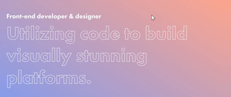
- Hero images that are all type. Hero images (full width, large image at the top of a web page) can be attention grabbing, but they also load slowly. Since load time is now a ranking factor, many are moving away from using hero images. Instead they use larger Typography to make a bold statement. In the image below the background is a gradient (not an image) and the type is bold and beautiful.

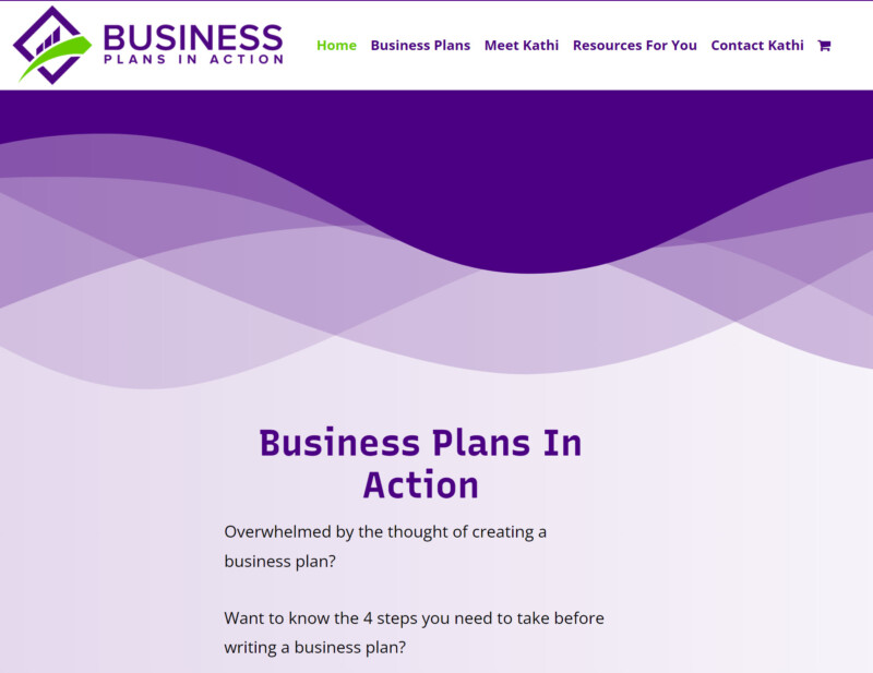
- For those that do not like the look of full-width, simple borders are trending. This is not the column look, but linear, colored borders that get applied to sections. These can also be section separators via color changes or a patterns (not images). The image below demonstrates this concept as well as typographical hero sections. There is a color change and pattern added for the section break. Also the simple color with text as the hero section adds interest and load speed. This website have very few images to slow it own.

- Movement – This can be text or animated sections. This does not refer to video or background videos. Animations are created with coding, so they do not significantly slow down websites. The trend of adding text movement will continue into 2022.
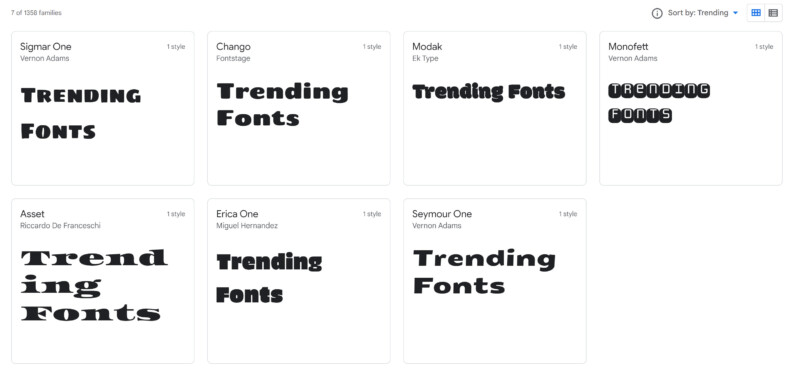
- Retro, bold fonts. Google fonts has changed web design. Before Google fonts, one had to use “web-safe” fonts, or they might get an unexpected result. Google fonts has made thousands of font types available for website usage. No longer are we limited to just a few fonts. Moving into 2022 to bolder fonts are trending for attention grabbing sections.

- Black and white designs. These are websites with black backgrounds, and everything else is white. The logo, text, and any other graphics are all white. This creates a high contrast, and these sites can be beautiful with a minimalistic approach.
- Dark Mode – This website has a black background and contrasting colors. The dark pallet is making a return!
- Gaussian blurs – these are backgrounds that are very soft and the colors blend together. They are blurred with no sharp areas. This can be a very feminine look that just uses color.
Is your website ready for 2022?
Websites are meant to evolve and change along with your business. They are not created once and then done. Not only does the information need to be kept current, the look and feel of the website needs to stay current with modern design. Companies need to change parts of their website at least every few years. Otherwise they risk looking dated. Having a business look that is dated tells your customers that you are not keeping up with current trends. Sometimes it can even make your business look abandoned.
If you are ready for a new look for 2022, give Dotty at Premium Websites a call. She can listen to your ideas and make them become a reality.
